Lab 03
Visualization and Tables
ronald.walker@berkeley.edu
Python Data Types
1. int
2. float
3. str
4. bool
Today
on the worksheet
> classifications of data irl> proper representations of data
in the lab
> ways of working with data >>Tables<<A. Violence in California
a. Categorical or Numerical?
1. City: Categorical
2. Num_Involved_Civilians: Numerical
3. Zip_Code: Categorical
A. Violence in California
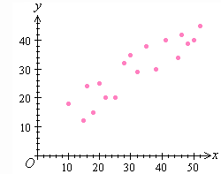
B. What type of visualization?
Scatter Plot
B. What would it look like?
B. Climate Change
what could be improved on this graph?

label y axis, reduce range of y values
C. Fast Food Chains
what about this one?

The graph has a very low data to ink ratio. It uses a lot of chartjunk. All the information contained could be visualized very clearly in a simple bar chart. (Note that we are examining a categorical against a numerical variable). The x axis is particularly confusing. As the amount of money from sales grows, the logos also seem to scale up, however, their width does not seem to correspond to anything.
D. Invest Now
Dogecoinannouncements
1. Small Group Tutoring
2. Resources Page
3. Office Hours